#BLOG5 Data Visualization using AWS QuickSight
** It goes without saying, You need to have an AWS account to practice this demo. Well, it is good to at least give it a read, what if you like it and decide to create an AWS account :) **
You can use this blog as an extension to the ETL process I explained in BLOG2. Although I am using a different happiness dataset which is World Happiness Report 2023 from Kaggle. You can use the dataset from BLOG2 and continue with this analysis. The content of today’s dataset includes:
The happiness scores and rankings data from the Gallup World Poll. The columns following the happiness score estimate the extent to which each of the six factors – economic production, social support, life expectancy, freedom, absence of corruption, and generosity – contribute to making life evaluations higher in each country than they are in Dystopia, a hypothetical country that has values equal to the world’s lowest national averages for each of the six factors. They have no impact on the total score reported for each country, but they do explain why some countries rank higher than others
In this blog, I will be explaining how to use QuickSight integrated with AWS S3 for data visualization.
GitHub: https://github.com/jay1299/AWS-QuickSight
Let us first set up S3:
Go to S3 Bucket and click on create a new bucket.
Provide any required name you wish, leave other details as default, and hit on create bucket button.
Upload the dataset file from the link.
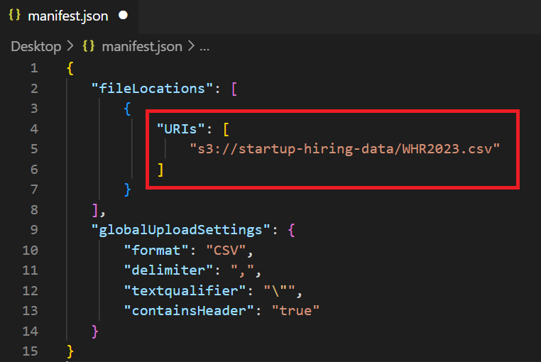
Now, upload the manifest.json file from the link but first make the below changes in it:
Copy the URL from WHR2023.csv and paste it into the manifest.json file URL’s tag as below.
Done! Your S3 bucket is set up with the required data. Let’s jump to AWS QuickSight.
QuickSight:
Go to AWS QuickSight and if you have not already used it then it will ask you to sign up:
Click on signup and choose enterprise account type and press continue.
In the next screen enter your “QuickSight account name” in the Account info section and enter your mail address for updates.
Now, select the S3 bucket by scrolling down and checking it.
Select S3 buckets → and you will get a list of buckets if you are using S3 else just the bucket name we created above. Choose the bucket name you created above and click on Finish.
Keep the rest of the settings as default and click on Finish.
To avoid any charges, make sure you cancel this subscription before 30 days
Give it some time and you will see a congratulations message, click on “Go to QuickSight” and you are ready to visualize your data.
Click on Dataset from the left panel:
Click on the new dataset from the top right and select S3 as the service to integrate your dataset with QuickSight:
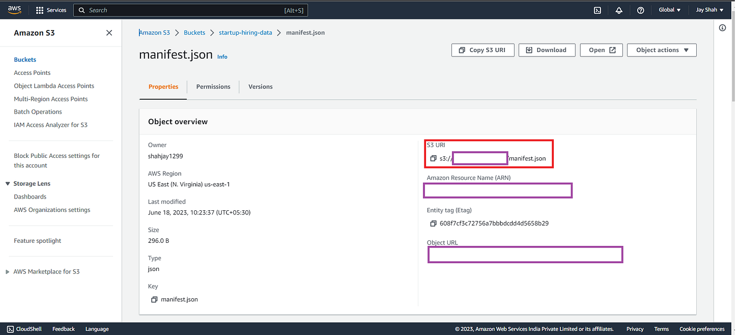
Copy the below URL(Red bordered) from S3’s Manifest.json file:
And paste the URL in QuickSight as below and click on connect:
You will see a new pop-up with available storage to analyze the data, click on visualize and select the interactive sheet and you will see a screen like below:
From the left Visualize panel, you can see the column names extracted from our S3 dataset. You can simply drag and drop them in the center autograph canvas to start the analysis. You can easily play with different types of graphs from the left-bottom and it will ask for more inputs if needed for your selected chart type.
Now, the fun begins! I have chosen the country name as X-axis and filtered the countries for fewer data representations. Using the target as Dystopia + residual and the target value as Health Life Expectancy.
From the above we can understand:
Egypt has the lowest healthy life expectancy and has less suffering or injustice in the country.
China is having an average healthy life expectation along with above-average suffering when compared with other countries.
In the above donut chart, I have used the country name and perception of corruption data. From the chart, we understand the following:
Finland has the maximum corruption perception and the lowest is analyzed in Afghanistan(Whitish-grey), its name is not visible because it was overwriting Italy hence I have disabled it.
Quick learning: Check how you can disable and enable label overwriting in the chart
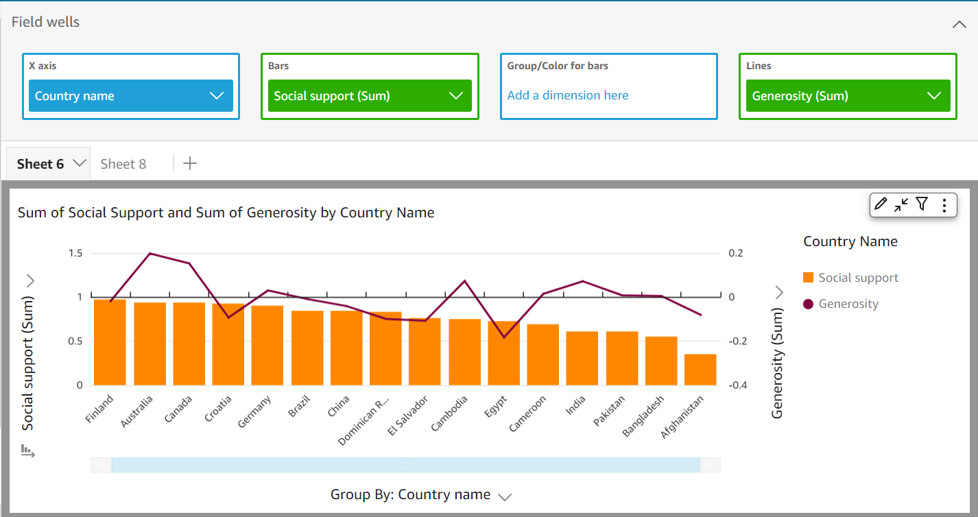
The above chart is to depict Social support along with the generosity of people in a country. You can observe the input I have given in the field wells’s X-axis, Bars, and Lines.
When you minimize the input row, the visualization is pretty analyzable as above.
From the above chart, we can observe that:
The Dominican Republic has average social support and an average amount of its population is generous to each other.
The Generosity index is considered the best in Australia where the index touches the ceiling amongst the others.
Thank you for reading this blog!
Do try it yourself in AWS QuickSight for different datasets and different charts. If you feel this blog is worth reading then drop a 🧡 in the comment section and also let me know about any new tech topic blogs!
Read my recent blog on IndexedDB which is an offline database for your browser with a hands-on demo:
#BLOG4 Meet IndexedDB, which stores your data locally in a browser
You read it right! IndexedDB can store your data easily in any browser and you can test it using the console option. But let us first understand what is IndexedDB.
GitHub: https://github.com/jay1299/IndexedDB
What is IndexedDB? It is a NoSQL data storage solution API for client-side storage. It can store structured data and blobs. Apart from storing data on the user’s browser, you can even run queries on your stored data using transactions. You can use get() and put() method types to perform operations like inserting, updating, and retrieving the data.
Read our latest tech newsletter #NL20 published on 16/06/2023:
#NL20 Beatles album to release John Lennon's AI voice |Binance terminates service in Netherlands |Russian hacker attacks Ukraine military system |Alibaba to launch E-commerce site in Europe| and more.
On the Beatles’ New Album, John Lennon’s Voice Will be Replaced by Artificial Intelligence:
You can run an ad or news in our newsletters which gets you ahead by decluttering your product/article/project/innovation in tech and bringing your expected audience closer to you.


